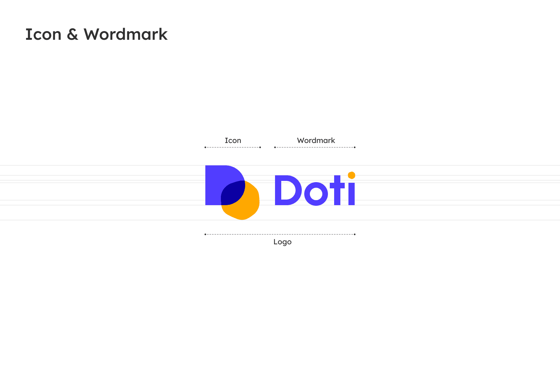
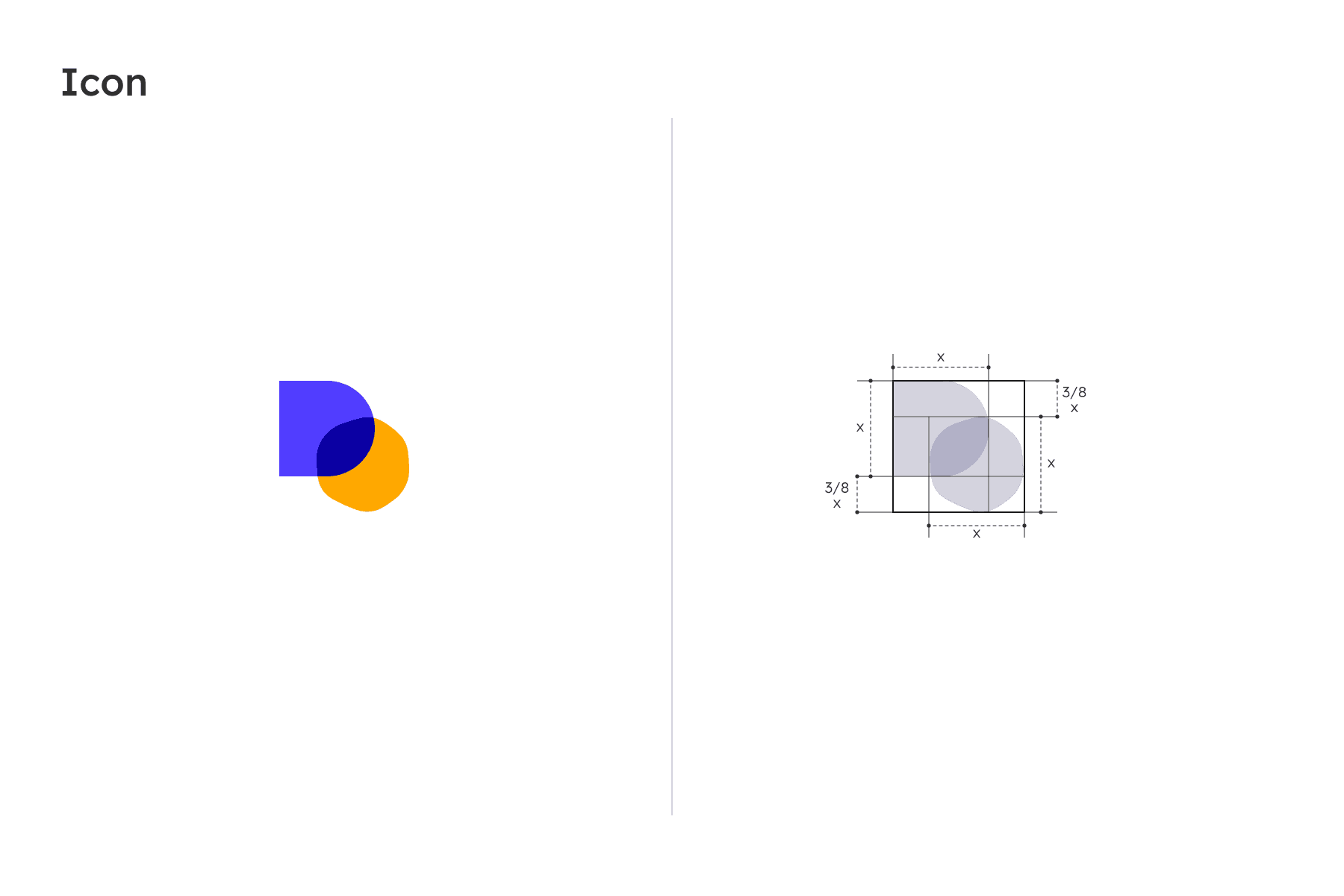
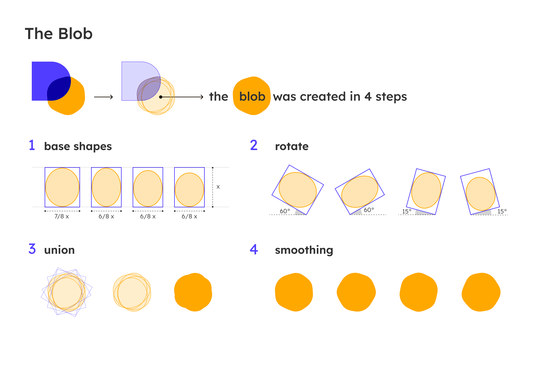
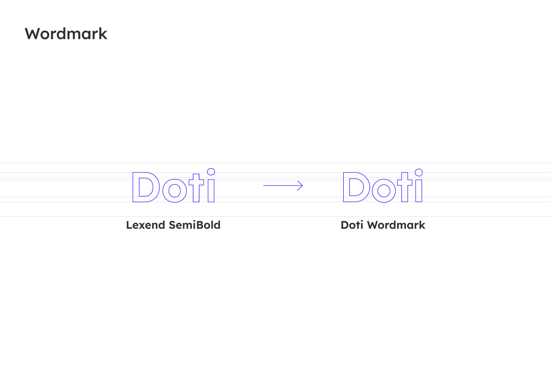
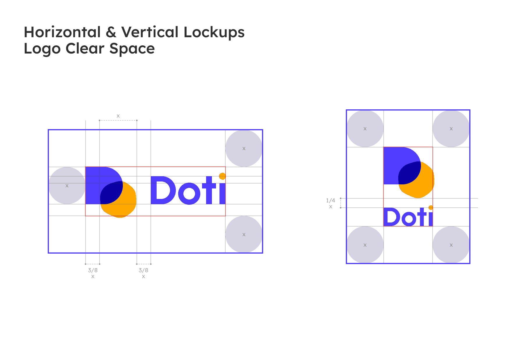
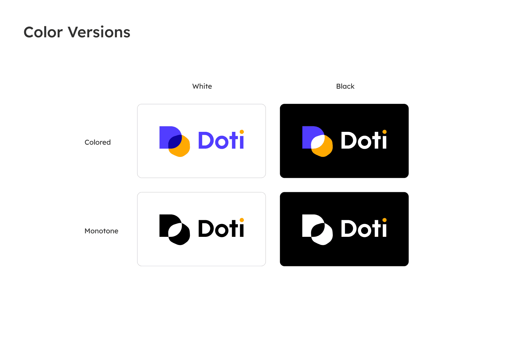
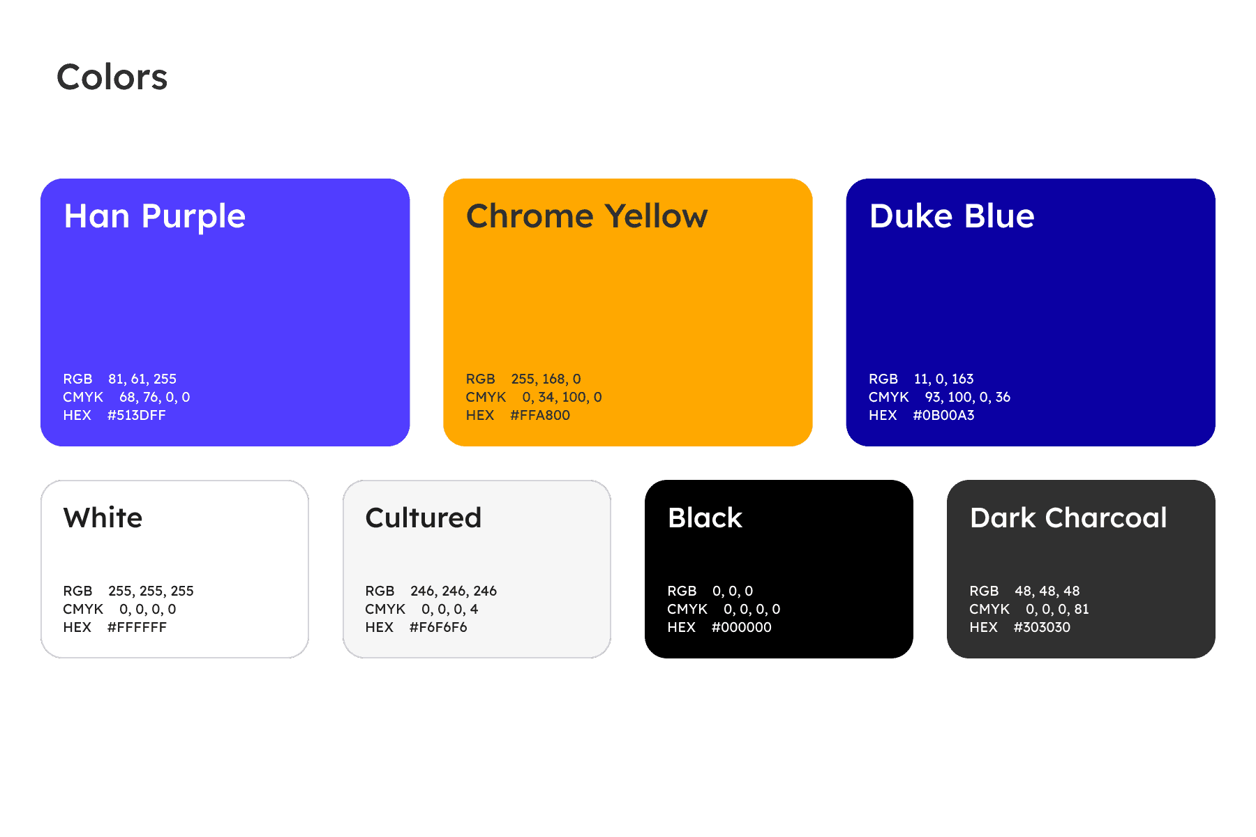
We were commissioned to design a brand identity that visually translates their core mission of "making connections." The new logo features a dynamic geometric icon where a structured blue 'D' shape intersects with an energetic orange circle. Directly inspired by a Venn diagram and built on a precise proportional grid, this translucent overlap beautifully represents the seamless integration of disparate teams and data. Paired with a clean, modern wordmark punctuated by a matching orange dot, the resulting design perfectly encapsulates Doti’s role as a powerful, unifying enterprise tool.
Agency:
Onteractive
Concept & Visual:
Veerklempt & Yup Nguyen
Motion:
Yup Nguyen